05:00
Week 6 Starter File
Intermediate Visualizations

The following sections of the book (R for Data Science) used for the first portion of the course are included in the first week:
Link to other resources
Internal help: posit support
External help: stackoverflow
Additional materials: posit resources
Cheat Sheets: posit cheat sheets
Choose the right chart: R charts guide
Getting Inspired: R charts examples
Extending ggplot: ggplot extensions
While I use the book as a reference the materials provided to you are custom made and include more activities and resources.
If you understand the materials covered in this document there is no need to refer to other resources.
If you have any troubles with the materials don’t hesitate to contact me or check the above resources.
Going beyond the basic
In the basic data visualization class, we built a solid foundation, learning how to create compelling charts with ggplot2. We explored the essential template of a plot, how to control aesthetics like axes mapping, color, fill, size, alpha, and shape. We emphasized the importance of understanding your data, focusing on the columns data type and chart objective to make informed decisions when choosing the right chart. By working with distribution, ranking, correlation, and evolution charts, you gained hands-on experience with some of the most commonly used geoms and you’ve gotten a taste of how powerful visualizations can be in uncovering insights from your data.
Now, as we transition into the beyond basic data visualization class, we will build on this foundation and take your skills to the next level. We’ll cover more advanced topics like static mapping to fix aesthetics to specific values, faceting to create multiple subplots for better comparison, and using multiple geoms in a single plot to enrich your visualizations. The tools covered in this class will open up new ways to explore, present, and gain deeper insights from your data. Get ready to elevate your skills and bring your data to life in ways that will captivate your audience!
Load packages
This is a critical task:
Every time you open a new R session you will need to load the packages.
Failing to do so will incur in the most common errors among beginners (e.g., ” could not find function ‘x’ ” or “object ‘y’ not found”).
So please always remember to load your packages by running the
libraryfunction for each package you will use in that specific session 🤝
Ggplot chart template
Important
ggplot(data = <DATA>, mapping = aes(<MAPPINGS>)) + <GEOM_FUNCTION>()
Let’s learn how to complete and extend this template beyond the basic.
Static mapping
So far, we’ve seen that when you map an aesthetic to a variable, the ggplot2 package automatically handles the rest. It dynamically selects an appropriate scale for the aesthetic and even generates a legend to explain the relationship between the variable and its visual representation. For aesthetics like x and y, instead of a legend, ggplot2 creates axis lines with tick marks and labels, which serve as guides, showing how data points correspond to values.
But what if you want more control? What if you want to manually adjust the layout of your chart to better fit your needs/preferences? Can you do that?
The answer is yes! Let’s explore how.
- we simply specify the color we want inside the geom using the
colorargument. Remember that colors are strings!
- we simply specify the size we want inside the geom using the
sizeargument. Remember that size is measured in millimiters!
- we simply specify the shape we want inside the geom using the
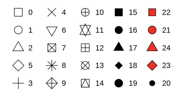
shapeargument. Remember that there are many shapes available and they are identified by numbers (see figure below for more info)!
Note
In the chart above color, size and shape are not dynamically mapped to a variable but rather manually/statically assigned by you. Static mapping only help to change the look/physical appearance of your chart but it doesn’t add more information compared to the original chart!
Important
To set an aesthetics (color, size., shape) manually/statically, set them by name as an argument of your geom function; i.e. they go outside of aes() and do not map them to a variable!
Moreover, you need to pick a level that makes sense for that aesthetic:
The name of a color as a character string (“blue”).
The size of a point in mm (2).
The shape of a point as a number (18), see figure below.
Let’s create a few more charts to practice static mapping:
Let’s now check the distribution of highway fuel efficiency among the cars in this dataset:
What happens if I try fill?
Let’s now check the distribution of hwy by car class using a boxplot.
Does size help here to improve the chart appearance? Try without it!
Create a violin chart that show the distribution of cty (y axis) by drv (x axis). Make sure the violin distributions are filled with dark gold color (“gold4”).
Do you like the color? Change it with your favorite color!
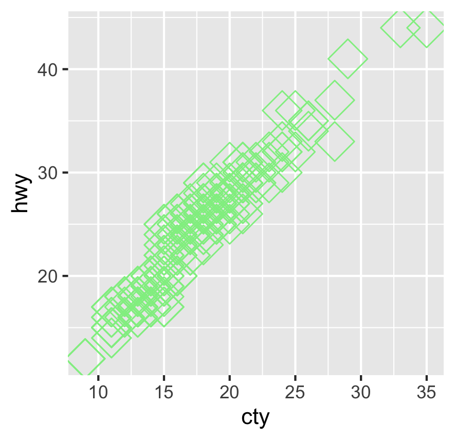
Create a scatterplot that shows the relationship between cylinders and city fuel efficiency. Change the color to grey, size to 3 mm and shape to 12.
Do you like this chart? Try to improve its look with your artistic touch!
Activity 1 (a & b in class c & d at home): Charts with static mapping - 5 minutes:
[Write code just below each instruction; finally use MS Teams R - Forum channel for help on the in class activities/homework or if you have other questions]
Create a bar chart that show the engine size distribution on the y axis and use different shape for each car class. Make sure the color of the bar is red.
What do you notice?
Create a boxplot between the city fuel efficiency (y) and fl (x). Make sure that the boxplot are filled with a pink color.
Create a bar chart that show the drv ranking on the x axis. Make sure the color of the bar is yellow.
Create a scatterplot between the city fuel efficiency (y) and number of cylinders (x) assign a different size to each class. Make sure that the points color is orange and the shape of the points is 2.
Knowledge Check 1
Question: What static mapping was used in the chart above?
- answer 1: color, size, shape
- answer 2: color, shape
- answer 3: color, size
- answer 4: fill, size, shape
Faceting
One powerful way to incorporate additional variables into a chart is by mapping them dynamically through aesthetics inside the aes() function. However, especially when working with categorical variables, another effective method is to use faceting, which splits your plot into multiple subplots—each displaying a subset of the data. This is almost like visually ‘grouping’ your data, similar to how we used group_by() in data manipulation. However, instead of summarizing values, faceting allows us to see the observations within each group displayed in separate charts, making patterns or differences easier to spot.
To facet your chart by a single variable, you can use facet_wrap(), where the variable passed should be discrete. If you want to facet by the combination of two variables, you can apply facet_grid(), allowing you to create a matrix of plots that can reveal deeper insights into your data’s structure.
Just for reference I am putting the original chart here. This way it will be easier to see the impact of faceting.
Now, we facet on one categorical variable.
Or…
Now, we facet on two categorical variables.
Or…
What is the nrow argument doing?
This time you are faceting on two variables. What do you notice?
There are some combinations of values that do not have data points in your dataset. For example 5 cyl and all wheel drive. This gives you also an indication of the most common configurations of car based on cyl and drive mode and how they behave in terms of consumption. 4 cyl, front wheel drive seems to have the best high way gas mileage.
Create a boxplot that shows the distribution of cty (x axis) by manufacturer (y axis). Make sure to have a separate plot for each drv value.
Create a smoothingline plot that shows the relationship between hwy (y axis) and displ (x axis). Moreover, make sure to create mini plots based on the drv and fl variables.
Activity 2 (a & b in class c & d at home): Charts with faceting - 7 minutes:
[Write code just below each instruction; finally use MS Teams R - Forum channel for help on the in class activities/homework or if you have other questions]
Create a scatterplot between the highway fuel efficiency (y) and number of cylinders (x) assign a different color to each drv. Make sure to facet by class and to show the subplots on 2 rows.
Create a boxplot of the city fuel efficiency (y) and engine size (x) assign a different color to each drv. Make sure to facet by manufacturer and trans.
What do you think about this chart?
Create a bar chart between the highway fuel efficiency (x) and manufacturer (y) assign a different fill to each cyl. Make sure to facet by trans and drv.
Create a violin chart between the highway fuel efficiency (x) and class (y) assign a different color to each class. Make sure to facet by drv.
More on geometric objects
A geom is the geometric shape a plot uses to represent data. We’ve already discussed how choosing the right geom is essential and how much the different geoms impact the final outcome of your visual. But beyond selecting the right geom, it’s important to understand how aesthetics like color, size, and shape can vary depending on the geom you choose.
Each geom interprets these aesthetics differently, so by changing the geom, you’re not just changing the chart type—you’re also affecting how the visual elements are displayed, giving your plot more depth and meaning. From now on, when you change the geom remember that you probably need to change also the aesthetics used.
Caution
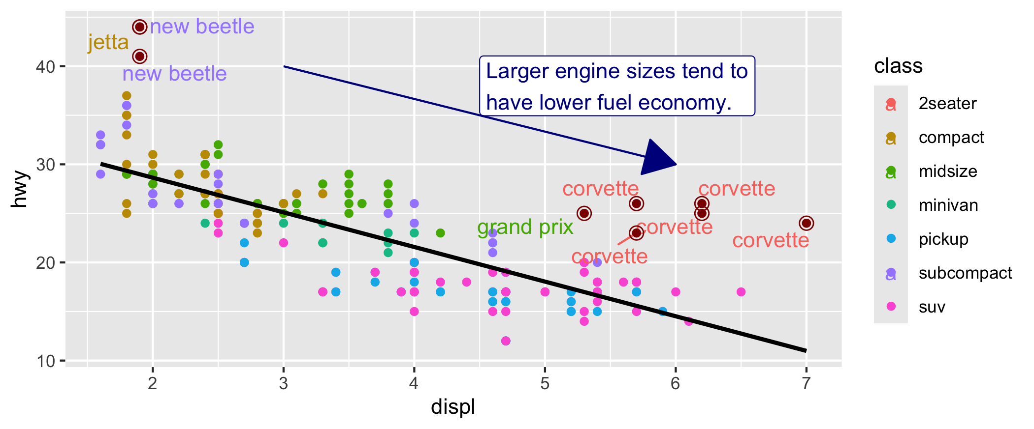
Every geom function in ggplot2 takes a mapping argument. However, not every aesthetic works with every geom. For example: you could set the shape of a point, but you couldn’t set the “shape” of a line. On the other hand, you could set the linetype of a line and not of a point. geom_smooth() will draw a different line, with a different linetype, for each unique value of the variable that you map to linetype.
In the above examples geom_smooth() separates the cars into three lines based on their drv value, which describes a car’s drive train. This way you can see how the drive train impact the relationship between hwy and engine size. Remember, 4 stands for four-wheel drive, f for front-wheel drive, and r for rear-wheel drive.
Notice the warning and that the shape of the line doesn’t change but it still distinguish 3 separate line. The problem is that you can’t determine which one is which.
Multiple geoms on the same chart
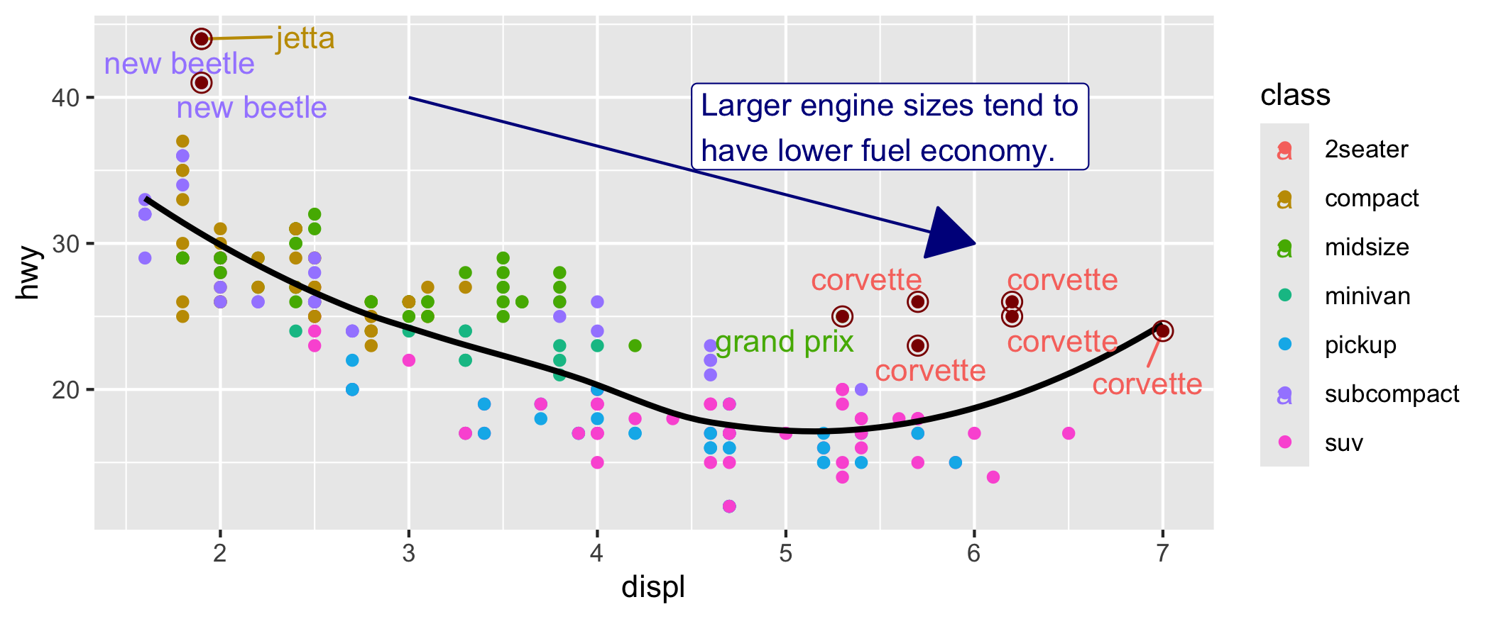
One of the powerful features of ggplot2 is the ability to layer multiple geoms on the same chart. This allows you to combine different visual elements and create more insightful visualizations. For example, you might use points to represent individual data values while overlaying a smooth line to show a trend. By layering geoms, you’re able to reveal different aspects of your data in one cohesive view, enriching the story your visualization tells. The flexibility of multiple geoms opens up new ways to highlight patterns, relationships, and trends that might not be as clear with a single geom.
Because we are inserting the mapping inside the ggplot() function the ggplot2 package will treat these mappings as global mappings that apply to each geom in the graph. So, adding a second geom is as simple as adding a new layer. Let’s check how in the examples below:
Try to set a static mapping alpha of 0.3 and width to 1.4 in the geom_violin.
Try to set a static mapping alpha to 0.3 and width to 0.15 in the geom_boxplot.
Important
The order in which you layer geoms significantly affects the final visualization, much like stacking one chart on top of another. The layering sequence matters because elements added later can obscure or enhance the ones added before. Think of it as building up the plot step by step.
Just as the |> operator in data manipulation allows you to chain operations, the + in ggplot2 lets you seamlessly stack layers in your plot. Understanding this parallel helps you see how both data manipulation and visualization follow a logical flow of transformation and refinement.
Activity 3 (a & b in class c & d at home): Multiple geoms charts. - 7 minutes
[Write code just below each instruction; finally use MS Teams R - Forum channel for help on the in class activities/homework or if you have other questions]
Plot the distribution of cty (y axis) by class (x axis) with both a violin and a boxplot chart. Make sure each class is filled with a different color.
Plot the relationship between hwy (y axis) and displ (x axis) with both points and a smoothing line. Make sure to have different color for each drv.
Plot the relationship between cty (y axis) and displ (x axis) with both a smoothing line and points. Make sure to have different color for each class.
Plot the distribution of hwy (y axis) by trans (x axis) with both a boxplot and a violin chart. Make sure each trans has a different color.
Ggplot’s real superpower: combining global with local mappings
Combining global and local mappings allows for flexible control over your visualizations. When you define mappings inside a geom function, they are considered local mappings—specific to that layer only. These local mappings can either add to or override the global mappings defined in the main ggplot() call, giving you the power to display different aesthetics across different layers of your chart. This technique is particularly useful when you want certain layers to stand out with unique colors, shapes, or sizes, without affecting the entire plot.
Beyond aesthetics, this flexibility extends to data as well; you can assign different datasets to individual layers, enabling you to overlay distinct visual representations in a single chart. This dynamic interplay between global and local settings is what makes ggplot2 so versatile, allowing you to tell a more nuanced data story.
The color applies only to the points because it is specified in that geom. While the other aesthetics apply to both because they are specified in the global settings of the chart.
Here, our smooth line displays just a subset of the mpg dataset, the subcompact cars. The local data argument in geom_smooth() overrides the global data argument in ggplot() for that layer only. Just keep in mind that we are basically filtering only the subcompact cars to draw the line. This can be extremely powerful if you want to show how they perform compared to all the others.
Can you tell me what those car points are?
What do you think about this chart?
Caution
This is a great chart to break the ice at the beginning of a presentation and ask people if they can guess what each line is representing. But you should manually create a legend if you put it into a report because it is not self-standing/explanatory. Only if we look at the code we know that those line indicate specific classes.
Activity 4: Unleash ggplot power and control global and local mappings - 7 minutes:
[Write code just below each instruction; finally use MS Teams R - Forum channel for help on the in class activities/homework or if you have other questions]
Plot the relationship of cty and displ with both a scatterplot, a smoothing line and a line chart. Do not replicate the mapping. Make sure the points color changes based on car drv. Make sure the smoothing line color is “darkred” and there is no shaded grey area around the line.. Make sure to show only the front wheel drive cars for the line chart and that the line is “darkblue”.
Plot the relationship between cyl and cty with both points and a smoothing line. Do not replicate the mapping. Make sure to assign a different color to the points based on car trans. Moreover, show a line only for the suv and a separate line for all the car classes that are not suv. Make sure to set se=TRUE. Make sure you can distinguish between the two lines.
Plot the relationship between engine size and cty with both points and a smoothing line. Do not replicate the mapping. Make sure to assign a different color and linetype to the line based on car drv. Moreover, show the points representing the audi manufacturer as “gold2” and the points representing all the other manufacturer as “purple2”.
Plot the distribution of engine size by transmission with both boxplot and a violin. Do not replicate the mapping. Make sure to assign a different fill based on drv to just the boxplot.
Important
I won’t be covering or testing you on the materials beyond this point. However, I’ve made the “Completing the chart” section below available for those of you who are captivated by the fascinating world of data visualization with ggplot and want to explore further.
Completing the chart
The charts we have created so far are definitely insightful and useful. However, they are missing some important final touches. Details can make a difference so now we will learn how to add them. The good news is that also in this case, adding them means adding a layer to our chart.
While the idea is the same.. adding these details clearly enhance the complexity of the chart and it is important to execute one layer at the time if you run into errors.
In some scenario axis name equal to column names is enough. However, we can enhance the chart by making the axis name more intelligible for people that are not expert of mpg dataset. Finally, adding a title can help in explaining the chart purpose.
Color palette selection in charts can have a big impact on the chart readability for some individuals. Achromatopsia affects an estimated 1 in 30,000 people worldwide. By changing the color palette we can make an impact in those affected. Create accessible charts is extremely important to make sure everyone can appreciate your creation!
Finally, the theme you chose for your chart can have big impact on it. As always, the option in ggplot are many. I personally prefer simplicity in charts but you can really have fun with them (even without taking into account those available in ggplot extensions). See the list here
Try also the classic, bw, minimal and linedraw themes.. they are valid alternatives to theme light.
In past two weeks you have created charts in R and you have discovered how powerful the ggplot2 package is. If you are passionate about visualizations try to create similar charts using datasets of your interest. Remember that practice makes perfect. Moreover, you always need to explore and get to know your data before making any modeling on them. Charts will help you in visually exploring the variables in your dataset and the relationships among them. Welcome to the magic world of visualizations!